Makie
Plots
Makie 是高性能,可扩展且跨平台的 Julia 语言绘图系统,是 Plots 外的另一选择(参考 Plots 文档总结)。
做数据可视化
Maki-e 来源于日语, 它指的是一种在漆面上撒金粉和银粉的技术。 数据就是我们这个时代的金和银,让我们在屏幕上制作美丽的数据图吧!
Simon Danisch,
Makie.jl创始人
与其他绘图包一样,该库的代码分为多个包。
Makie.jl是绘图前端,它定义了所有创建绘图对象需要的函数。虽然这些对象存储了绘图所需的全部信息,但还未转换为图片。因此,我们需要一个 Makie 后端。- 默认情况下,每一个后端都将
Makie.jl中的API都重新导出了,因此只需要安装和加载所需的后端包即可。
目前主要有三个后端实现了 Makie 中定义的所有抽象类型的渲染功能。
CairoMakie.jl能够绘制 2D 非交互式的出版物质量级矢量图GLFW.jl(支持 GPU),GLMakie.jl是交互式 2D 和 3D 绘图库WGLMakie.jl是基于 WebGL 的交互式 2D 和 3D 绘图库,运行在浏览器中
以下将只介绍一些 CairoMakie.jl 和 GLMakie.jl 的例子。
使用任一绘图后端的方法是 using 该后端并调用 activate! 函数。示例如下:
using GLMakie
GLMakie.activate!()
现在可以开始绘制出版质量级的图。 但是,在绘图之前,应知道如何保存。 save 图片 fig 的最简单方法是 save("filename.png", fig)。 CairoMakie.jl 也支持保存为其他格式,如 svg 和 pdf。 通过传递指定的参数可以轻松地改变图片的分辨率。 对于矢量格式,指定的参数为 pt_per_unit。例如:
save("filename.pdf", fig; pt_per_unit=2)或
save("filename.pdf", fig; pt_per_unit=0.5)对于 png,则指定 px_per_unit。 查阅 后端 & 输出 可获得更多详细信息。
另一重要问题是如何可视化输出数据图。 在使用 CairoMakie.jl 时,Julia REPL 不支持显示图片, 所以你还需要 IDE(Integrated Development Environment,集成开发环境),例如支持 png 或 svg 作为输出的 VSCode,Jupyter 或 Pluto。 另一个包 GLMakie.jl 则能够创建交互式窗口,或在调用 Makie.inline!(true) 时在行间显示位图。
还需注意的是,由于 Julia 是即时编译的,因此绘制第一张图需要等待较长时间,之后调用就会快很多,你也可以考虑调用 precompile 函数
CairoMakie
我们开始绘制的第一张图是标注了散点的直线:
using CairoMakie
CairoMakie.activate!()
注意前面的图采用默认输出样式,因此需要使用轴名称和轴标签进一步调整。
同时注意每一个像 scatterlines 这样的绘图函数都创建了一个 FigureAxisPlot 列表,其中包含 Figure, Axis 和 plot 对象。 这些函数也被称为 non-mutating 方法。 另一方面, mutating 方法(例如 scatterlines!,注意多了 !) 仅返回一个 plot 对象,它可以被添加到给定的 axis 或 current_figure() 中。
属性
使用 attributes 可以创建自定义的图,实现改变颜色或标记等。 设置属性可以使用多个关键字参数。 每个 plot 对象的 attributes 列表可以通过以下方式查看:
fig, ax, pltobj = scatterlines(1:10)

julia> pltobj.attributes
Attributes with 15 entries:
  color => RGBA{Float32}(0.0,0.447059,0.698039,1.0)
  ...
或者调用 pltobject.attributes.attributes 返回对象属性的 Dict
对于任一给定的绘图函数,都能在 REPL 中以 ?lines 或 help(lines) 的形式获取帮助。Julia将输出该函数的相应属性,并简要说明如何使用该函数。
不仅 plot 对象有属性,Axis 和 Figure 对象也有属性。 例如,Figure 的属性有 backgroundcolor,resolution,font 和 fontsize 以及 figure_padding。 其中 figure_padding 改变了图像周围的空白区域,如图中的灰色区域所示。 它使用一个数字指定所有边的范围,或使用四个数的元组表示上下左右。
Axis 同样有一系列属性,典型的有 backgroundcolor, xgridcolor 和 title。 使用 help(Axis) 可查看所有属性。
在接下来这张图里,我们将设置一些属性:
lines(1:10, (1:10).^2; color=:black, linewidth=2, linestyle=:dash,
    figure=(; figure_padding=5, resolution=(600, 400), font="sans",
        backgroundcolor=:grey90, fontsize=16),
    axis=(; xlabel="x", ylabel="x²", title="title",
        xgridstyle=:dash, ygridstyle=:dash))
current_figure()
此例已经包含了大多数用户经常会用到的属性。 或许在图上加一个 legend 会更好,这在有多条曲线时尤为有意义。 所以,向图上 append 另一个 plot object 并且通过调用 axislegend 添加对应的图例。 它将收集所有 plot 函数中的 labels, 并且图例默认位于图的右上角。 本例调用了 position=:ct 参数,其中 :ct 表示图例将位于 center和 top, 如图所示:
lines(1:10, (1:10).^2; label="x²", linewidth=2, linestyle=nothing,
    figure=(; figure_padding=5, resolution=(600, 400), font="sans",
        backgroundcolor=:grey90, fontsize=16),
    axis=(; xlabel="x", title="title", xgridstyle=:dash,
        ygridstyle=:dash))
scatterlines!(1:10, (10:-1:1).^2; label="Reverse(x)²")
axislegend("legend"; position=:ct)
current_figure()
通过组合 left(l), center(c), right(r) 和 bottom(b), center(c), top(t) 还可以再指定其他位置。 例如,使用:lt 指定为左上角。
然而,仅仅为两条曲线编写这么多代码是比较复杂的。 所以,如果要以相同的样式绘制一组曲线,那么最好指定一个主题。 使用 set_theme!() 可实现该操作,如下所示。
使用 set_theme!(kwargs)定义的新配置,重新绘制之前的图:
set_theme!(; resolution=(600, 400),
    backgroundcolor=(:orange, 0.5), fontsize=16, font="sans",
    Axis=(backgroundcolor=:grey90, xgridstyle=:dash, ygridstyle=:dash),
    Legend=(bgcolor=(:red, 0.2), framecolor=:dodgerblue))
lines(1:10, (1:10).^2; label="x²", linewidth=2, linestyle=nothing,
    axis=(; xlabel="x", title="title"))
scatterlines!(1:10, (10:-1:1).^2; label="Reverse(x)²")
axislegend("legend"; position=:ct)
current_figure()
set_theme!()
caption = "Set theme example."
倒数第二行的 set_theme!() 会将主题重置到 Makie 的默认设置。 有关 themes 的更多内容请转到 主题
在进入下节前, 值得先看一个例子:将多个参数所组成的 array 传递给绘图函数来配置属性。 例如,使用 scatter 绘图函数绘制气泡图。
本例随机生成 100 行 3 列的 array ,这些数据满足正态分布。 其中第一列表示 x 轴上的位置,第二列表示 y 轴上的位置,第三列表示与每一点关联的属性值。 例如可以用来指定不同的 color 或者不同的标记大小。气泡图就可以实现相同的操作。
using Random: seed!
seed!(28)
xyvals = randn(100, 3)
xyvals[1:5, :]
对应的图如下所示:
fig, ax, pltobj = scatter(xyvals[:, 1], xyvals[:, 2]; color=xyvals[:, 3],
    label="Bubbles", colormap=:plasma, markersize=15 * abs.(xyvals[:, 3]),
    figure=(; resolution=(600, 400)), axis=(; aspect=DataAspect()))
limits!(-3, 3, -3, 3)
Legend(fig[1, 2], ax, valign=:top)
Colorbar(fig[1, 2], pltobj, height=Relative(3 / 4))
为了在图上添加 Legend 和 Colorbar,需将 FigureAxisPlot 元组分解为 fig, ax, pltobj。 我们将在 布局 讨论有关布局选项的更多细节。
通过一些基本且有趣的例子,我们展示了如何使用Makie.jl,现在你可能想知道:还能做什么? Makie.jl 都还有哪些绘图函数? 为了回答此问题,我们制作了一个 cheat sheet ,如图所示:
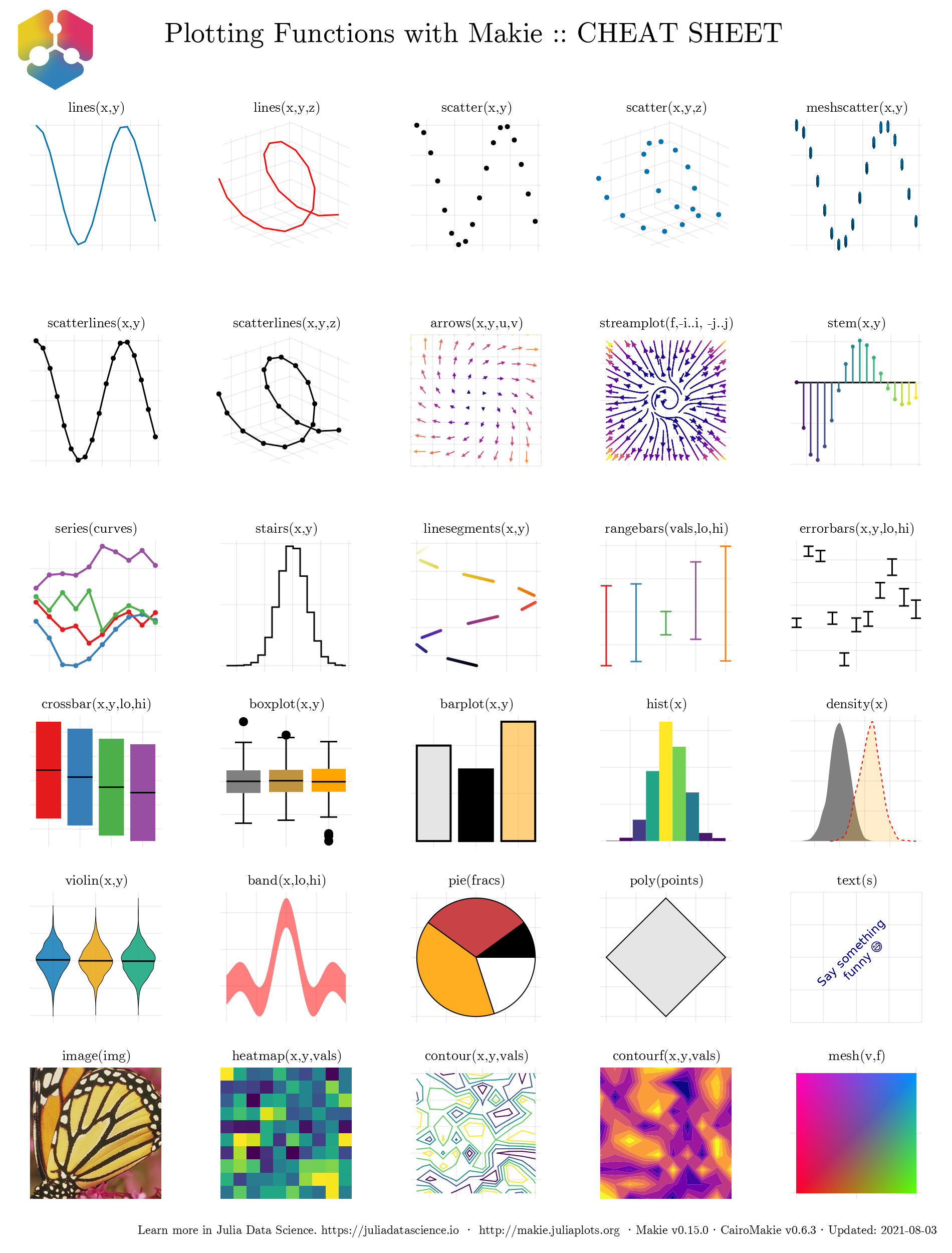
使用 CairoMakie.jl 后端可以轻松绘制这些图。
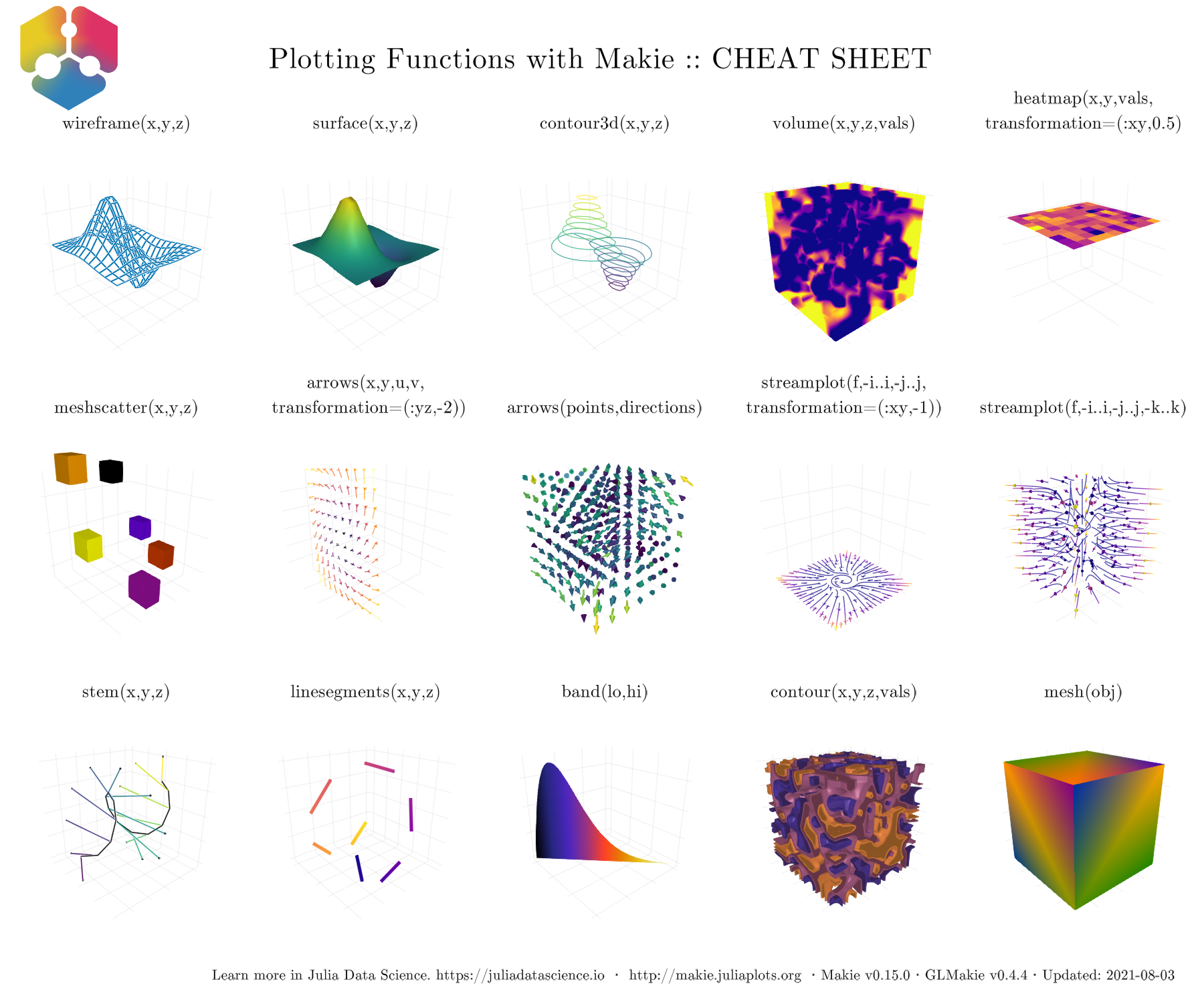
下图展示了 GLMakie.jl 的 cheat sheet ,这些函数支持绘制大多数 3D 图。 这些将在后面的 GLMakie.jl 节进一步讨论。
现在,我们已经大致了解到能做什么。接下来应该掉过头来继续研究基础知识。 是时候学习如何改变图的整体外观了。
主题
有多种方式可以改变图的整体外观。你可以使用 预定义主题 或自定义的主题。例如,通过 with_theme(your_plot_function, theme_dark()) 使用预定义的暗色主题。另外,也可以使用 Theme(kwargs) 构建你自己的主题或使用 update_theme!(kwargs) 更新当前激活的主题。
还可以使用 set_theme!(theme; kwargs...) 将当前主题改为 theme, 并且通过 kwargs 覆盖或增加一些属性。使用不带参数的 set_theme!() 即可恢复到之前主题的设置。在下面的例子中,我们准备了具有不同样式的测试绘图函数,以便于观察每个主题的大多数属性。
using Random: seed!
seed!(123)
y = cumsum(randn(6, 6), dims=2)
本例随机生成了一个大小为 (20, 20) 的矩阵,以便于绘制一张热力图(heatmap)。 同时本例也指定了 x 和 y 的范围。
using Random: seed!
seed!(13)
xv = yv = LinRange(-3, 0.5, 20)
matrix = randn(20, 20)
matrix[1:6, 1:6] # first 6 rows and columns
因此,新绘图函数如下所示:
function demo_themes(y, xv, yv, matrix)
    fig, _ = series(y; labels=["$i" for i = 1:6], markersize=10,
        color=:Set1, figure=(; resolution=(600, 300)),
        axis=(; xlabel="time (s)", ylabel="Amplitude",
            title="Measurements"))
    hmap = heatmap!(xv, yv, matrix; colormap=:plasma)
    limits!(-3.1, 8.5, -6, 5.1)
    axislegend("legend"; merge=true)
    Colorbar(fig[1, 2], hmap)
    fig
end注意,series 函数的作用是同时绘制多条附带标签的直线图和散点图。另外还绘制了附带 colorbar 的 heatmap。如图所示,有两种暗色主题,一种是 theme_dark() ,另一种是 theme_black()。
with_theme(theme_dark()) do
    demo_themes(y, xv, yv, matrix)
end
with_theme(theme_black()) do
    demo_themes(y, xv, yv, matrix)
end

另外有三种白色主题,theme_ggplot2(),theme_minimal() 和 theme_light()。这些主题对于更标准的出版图很有用。
with_theme(theme_ggplot2()) do
    demo_themes(y, xv, yv, matrix)
end
with_theme(theme_minimal()) do
    demo_themes(y, xv, yv, matrix)
end
with_theme(theme_light()) do
    demo_themes(y, xv, yv, matrix)
end


另一种方案是通过使用 with_theme(your_plot, your_theme()) 创建自定义 Theme 。 例如,以下主题可以作为出版质量图的初级模板:
publication_theme() = Theme(
    fontsize=16, font="CMU Serif",
    Axis=(xlabelsize=20, xgridstyle=:dash, ygridstyle=:dash,
        xtickalign=1, ytickalign=1, yticksize=10, xticksize=10,
        xlabelpadding=-5, xlabel="x", ylabel="y"),
    Legend=(framecolor=(:black, 0.5), bgcolor=(:white, 0.5)),
    Colorbar=(ticksize=16, tickalign=1, spinewidth=0.5),
)
为简单起见,在接下来的例子中使用它绘制 scatterlines 和 heatmap。
function plot_with_legend_and_colorbar()
    fig, ax, _ = scatterlines(1:10; label="line")
    hm = heatmap!(ax, LinRange(6, 9, 15), LinRange(2, 5, 15), randn(15, 15);
        colormap=:Spectral_11)
    axislegend("legend"; position=:lt)
    Colorbar(fig[1, 2], hm, label="values")
    ax.title = "my custom theme"
    fig
end
然后使用前面定义的 Theme,其输出如图所示
with_theme(plot_with_legend_and_colorbar, publication_theme())
如果需要在 set_theme!(your_theme)后更改一些设置,那么可以使用 update_theme!(resolution=(500, 400), fontsize=18)。 另一种方法是给 with_theme 函数传递额外的参数:
fig = (resolution=(600, 400), figure_padding=1, backgroundcolor=:grey90)
ax = (; aspect=DataAspect(), xlabel=L"x", ylabel=L"y")
cbar = (; height=Relative(4 / 5))
with_theme(publication_theme(); fig..., Axis=ax, Colorbar=cbar) do
    plot_with_legend_and_colorbar()
end
使用 LaTeXStrings.jl
通过调用 LaTeXStrings.jl,Makie.jl 实现了对 LaTeX 的支持:
using LaTeXStrings一个简单的基础用法例子如下所示,其主要包含用于 x-y 标签和图例的 LaTeX 字符串。
function LaTeX_Strings()
    x = 0:0.05:4π
    lines(x, x -> sin(3x) / (cos(x) + 2) / x; label=L"\frac{\sin(3x)}{x(\cos(x)+2)}",
        figure=(; resolution=(600, 400)), axis=(; xlabel=L"x"))
    lines!(x, x -> cos(x) / x; label=L"\cos(x)/x")
    lines!(x, x -> exp(-x); label=L"e^{-x}")
    limits!(-0.5, 13, -0.6, 1.05)
    axislegend(L"f(x)")
    current_figure()
end
with_theme(LaTeX_Strings, publication_theme())
下面是更复杂的例子,图中的text是一些等式,并且图例编号随着曲线数增加:
function multiple_lines()
    x = collect(0:10)
    fig = Figure(resolution=(600, 400), font="CMU Serif")
    ax = Axis(fig[1, 1], xlabel=L"x", ylabel=L"f(x,a)")
    for i = 0:10
        lines!(ax, x, i .* x; label=latexstring("$(i) x"))
    end
    axislegend(L"f(x)"; position=:lt, nbanks=2, labelsize=14)
    text!(L"f(x,a) = ax", position=(4, 80))
    fig
end
multiple_lines()
但不太好的是,一些曲线的颜色是重复的。 添加标记和线条类型通常能解决此问题。 所以让我们使用 Cycles 来添加标记和线条类型。 设置 covary=true,使所有元素一起循环:
function multiple_scatters_and_lines()
    x = collect(0:10)
    cycle = Cycle([:color, :linestyle, :marker], covary=true)
    set_theme!(Lines=(cycle=cycle,), Scatter=(cycle=cycle,))
    fig = Figure(resolution=(600, 400), font="CMU Serif")
    ax = Axis(fig[1, 1], xlabel=L"x", ylabel=L"f(x,a)")
    for i in x
        lines!(ax, x, i .* x; label=latexstring("$(i) x"))
        scatter!(ax, x, i .* x; markersize=13, strokewidth=0.25,
            label=latexstring("$(i) x"))
    end
    axislegend(L"f(x)"; merge=true, position=:lt, nbanks=2, labelsize=14)
    text!(L"f(x,a) = ax", position=(4, 80))
    set_theme!() # reset to default theme
    fig
end
multiple_scatters_and_lines()
一张出版质量的图如上所示。 那我们还能做些什么操作? 答案是还可以为图定义不同的默认颜色或者调色盘。 在下一节,我们将再次了解如何使用 Cycles 以及有关它的更多信息,即通过添加额外的关键字参数就可以实现前面的操作。
颜色和颜色图
在展示结果时,其中重要的一步是为图选择一组合适的颜色或 colorbar。 Makie.jl 支持使用 Colors.jl ,因此你可以使用 named colors 而不是传递 RGB 或 RGBA 值。 另外,也可以使用 ColorSchemes.jl 和 PerceptualColourMaps.jl 中的颜色图。 值得了解的是,可以使用 Reverse(:colormap_name) 反转颜色图 ,也可以通过 color=(:red,0.5) and colormap=(:viridis, 0.5) 获得透明的颜色或颜色图。
下文介绍不同的用例。 接下来使用新的颜色和颜色栏(Colorbar)调色盘来创建自定义主题。
默认情况下, Makie.jl 已经预定义一组颜色,可以循环使用该组颜色。 之前的图因此并未设置任何特定颜色。 覆盖这些默认颜色的方法是,在绘图函数中调用 color 关键字并使用 Symbol 或 String 指定新的颜色。 该操作如下所示:
function set_colors_and_cycle()
    # Epicycloid lines
    x(r, k, θ) = r * (k .+ 1.0) .* cos.(θ) .- r * cos.((k .+ 1.0) .* θ)
    y(r, k, θ) = r * (k .+ 1.0) .* sin.(θ) .- r * sin.((k .+ 1.0) .* θ)
    θ = LinRange(0, 6.2π, 1000)
    axis = (; xlabel=L"x(\theta)", ylabel=L"y(\theta)",
        title="Epicycloid", aspect=DataAspect())
    figure = (; resolution=(600, 400), font="CMU Serif")
    fig, ax, _ = lines(x(1, 1, θ), y(1, 1, θ); color="firebrick1", # string
        label=L"1.0", axis=axis, figure=figure)
    lines!(ax, x(4, 2, θ), y(4, 2, θ); color=:royalblue1, #symbol
        label=L"2.0")
    for k = 2.5:0.5:5.5
        lines!(ax, x(2k, k, θ), y(2k, k, θ); label=latexstring("$(k)")) #cycle
    end
    Legend(fig[1, 2], ax, latexstring("k, r = 2k"), merge=true)
    fig
end
set_colors_and_cycle()
这里通过color 关键字指定了上例前两条曲线的颜色。 其余使用默认的颜色集。 稍后将学习如何使用自定义颜色循环。
关于颜色图,我们已经非常熟悉用于热力图和散点图的 colormap。下面展示的是,颜色图也可以像颜色那样通过 Symbol 或 String 进行指定。 此外,也可以是 RGB 颜色的向量。 下面是第一个例子,通过 Symbol, String 和分类值的 cgrad 来指定颜色图。 输入 ?cgrad 查看更多信息。
figure = (; resolution=(600, 400), font="CMU Serif")
axis = (; xlabel=L"x", ylabel=L"y", aspect=DataAspect())
fig, ax, pltobj = heatmap(rand(20, 20); colorrange=(0, 1),
    colormap=Reverse(:viridis), axis=axis, figure=figure)
Colorbar(fig[1, 2], pltobj, label = "Reverse colormap Sequential")
fig
当设置 colorrange 后,超出此范围的颜色值会被相应地设置为颜色图的第一种和最后一种颜色。 但是,有时最好自行指定两端的颜色。这可以通过 highclip 和 lowclip 实现:
using ColorSchemes
figure = (; resolution=(600, 400), font="CMU Serif")
axis = (; xlabel=L"x", ylabel=L"y", aspect=DataAspect())
fig, ax, pltobj=heatmap(randn(20, 20); colorrange=(-2, 2),
    colormap="diverging_rainbow_bgymr_45_85_c67_n256",
    highclip=:black, lowclip=:white, axis=axis, figure=figure)
Colorbar(fig[1, 2], pltobj, label = "Diverging colormap")
fig
另外 RGB 向量也是合法的选项。 在下面的例子中, 你可以传递一个自定义颜色图 perse 或使用 cgrad 来创建分类值的 Colorbar。
using Colors, ColorSchemes
figure = (; resolution=(600, 400), font="CMU Serif")
axis = (; xlabel=L"x", ylabel=L"y", aspect=DataAspect())
cmap = ColorScheme(range(colorant"red", colorant"green", length=3))
mygrays = ColorScheme([RGB{Float64}(i, i, i) for i in [0.0, 0.5, 1.0]])
fig, ax, pltobj = heatmap(rand(-1:1, 20, 20);
    colormap=cgrad(mygrays, 3, categorical=true, rev=true), # cgrad and Symbol, mygrays,
    axis=axis, figure=figure)
cbar = Colorbar(fig[1, 2], pltobj, label="Categories")
cbar.ticks = ([-0.66, 0, 0.66], ["-1", "0", "1"])
fig
最后,分类值的颜色栏标签默认不在每种颜色间居中。 添加自定义标签可修复此问题,即 cbar.ticks = (positions, ticks)。 最后一种情况是传递颜色的元组给 colormap,其中颜色可以通过 Symbol, String 或它们的混合指定。 然后将会得到这两组颜色间的插值颜色图。
另外,也支持十六进制编码的颜色作为输入。因此作为示范,下例将在热力图上放置一个半透明的标记。
figure = (; resolution=(600, 400), font="CMU Serif")
axis = (; xlabel=L"x", ylabel=L"y", aspect=DataAspect())
fig, ax, pltobj = heatmap(rand(20, 20); colorrange=(0, 1),
    colormap=(:red, "black"), axis=axis, figure=figure)
scatter!(ax, [11], [11], color=("#C0C0C0", 0.5), markersize=150)
Colorbar(fig[1, 2], pltobj, label="2 colors")
fig
自定义颜色循环
可以通过新的颜色循环定义全局 Theme ,但通常 不建议 这样做。 更好的做法是定义新的主题并像上节那样使用它。 定义带有 :color, :linestyle, :marker 属性的新 cycle 和默认的 colormap 。 下面为之前的 publication_theme 增加一些新的属性。
function new_cycle_theme()
    # https://nanx.me/ggsci/reference/pal_locuszoom.html
    my_colors = ["#D43F3AFF", "#EEA236FF", "#5CB85CFF", "#46B8DAFF",
        "#357EBDFF", "#9632B8FF", "#B8B8B8FF"]
    cycle = Cycle([:color, :linestyle, :marker], covary=true) # alltogether
    my_markers = [:circle, :rect, :utriangle, :dtriangle, :diamond,
        :pentagon, :cross, :xcross]
    my_linestyle = [nothing, :dash, :dot, :dashdot, :dashdotdot]
    Theme(
        fontsize=16, font="CMU Serif",
        colormap=:linear_bmy_10_95_c78_n256,
        palette=(color=my_colors, marker=my_markers, linestyle=my_linestyle),
        Lines=(cycle=cycle,), Scatter=(cycle=cycle,),
        Axis=(xlabelsize=20, xgridstyle=:dash, ygridstyle=:dash,
            xtickalign=1, ytickalign=1, yticksize=10, xticksize=10,
            xlabelpadding=-5, xlabel="x", ylabel="y"),
        Legend=(framecolor=(:black, 0.5), bgcolor=(:white, 0.5)),
        Colorbar=(ticksize=16, tickalign=1, spinewidth=0.5),
    )
end
然后将它应用到绘图函数中,如下所示:
function scatters_and_lines()
    x = collect(0:10)
    xh = LinRange(4, 6, 25)
    yh = LinRange(70, 95, 25)
    h = randn(25, 25)
    fig = Figure(resolution=(600, 400), font="CMU Serif")
    ax = Axis(fig[1, 1], xlabel=L"x", ylabel=L"f(x,a)")
    for i in x
        lines!(ax, x, i .* x; label=latexstring("$(i) x"))
        scatter!(ax, x, i .* x; markersize=13, strokewidth=0.25,
            label=latexstring("$(i) x"))
    end
    hm = heatmap!(xh, yh, h)
    axislegend(L"f(x)"; merge=true, position=:lt, nbanks=2, labelsize=14)
    Colorbar(fig[1, 2], hm, label="new default colormap")
    limits!(ax, -0.5, 10.5, -5, 105)
    colgap!(fig.layout, 5)
    fig
end
with_theme(scatters_and_lines, new_cycle_theme())
此时,通过颜色,曲线样式,标记和颜色图,你已经能够 完全控制 绘图结果。 下一部分将讨论如何管理和控制 布局
布局
一个完整的 画布/布局 是由 Figure 定义的,创建后将在其中填充各种内容。 下面将以一个包含 Axis,Legend 和 Colorbar 的简单例子开始。 在这项任务中, 就像 Array/Matrix 那样,可以使用 rows 和 columns 索引 Figure。 Axis 位于 第 1 行,第 1 列, 即为 fig[1, 1]。 Colorbar 位于 第 1 行,第 2 列, 即为 fig[1, 2]。 另外, Legend 位于 第 2 行 和 第 1 - 2 列, 即为 fig[2, 1:2]。
function first_layout()
    seed!(123)
    x, y, z = randn(6), randn(6), randn(6)
    fig = Figure(resolution=(600, 400), backgroundcolor=:grey90)
    ax = Axis(fig[1, 1], backgroundcolor=:white)
    pltobj = scatter!(ax, x, y; color=z, label="scatters")
    lines!(ax, x, 1.1y; label="line")
    Legend(fig[2, 1:2], ax, "labels", orientation=:horizontal)
    Colorbar(fig[1, 2], pltobj, label="colorbar")
    fig
end
first_layout()
这看起来已经不错了,但能变得更好。可以使用以下关键字和方法来解决图的间距问题:
figure_padding=(left, right, bottom, top)padding=(left, right, bottom, top)
改变 Legend 或 Colorbar 实际大小的方法为:
tellheight=trueorfalsetellwidth=trueorfalse将这些设置为
true后则需考虑Legend或Colorbar的实际大小(高或宽)。 然后这些内容将会相应地调整大小。
可以使用以下方法指定行和列的间距:
colgap!(fig.layout, col, separation)rowgap!(fig.layout, row, separation)列间距 (
colgap!),如果给定了col,那么间距将只应用在指定的列。 行间距 (rowgap!),如果给定了row,那么间距将只应用在指定的行。
接下来将学习如何将内容放进 突出部分(protrusion),即为 标题 x 和 y,或 ticks 以及 label 保留的空间。 实现方法是将位置索引改为 fig[i, j, protrusion], 其中 protrusion 可以是 Left(), Right(),Bottom() 和 Top(),或者是四个角 TopLeft(), TopRight(), BottomRight(),BottomLeft()。 这些选项将在如下的例子中使用:
function first_layout_fixed()
    seed!(123)
    x, y, z = randn(6), randn(6), randn(6)
    fig = Figure(figure_padding=(0, 3, 5, 2), resolution=(600, 400),
        backgroundcolor=:grey90, font="CMU Serif")
    ax = Axis(fig[1, 1], xlabel=L"x", ylabel=L"y",
        title="Layout example", backgroundcolor=:white)
    pltobj = scatter!(ax, x, y; color=z, label="scatters")
    lines!(ax, x, 1.1y, label="line")
    Legend(fig[2, 1:2], ax, "Labels", orientation=:horizontal,
        tellheight=true, titleposition=:left)
    Colorbar(fig[1, 2], pltobj, label="colorbar")
    # additional aesthetics
    Box(fig[1, 1, Right()], color=(:slateblue1, 0.35))
    Label(fig[1, 1, Right()], "protrusion", textsize=18,
        rotation=pi / 2, padding=(3, 3, 3, 3))
    Label(fig[1, 1, TopLeft()], "(a)", textsize=18, padding=(0, 3, 8, 0))
    colgap!(fig.layout, 5)
    rowgap!(fig.layout, 5)
    fig
end
first_layout_fixed()
这里在 TopLeft()添加标签 (a) 可能是不必要的, 因为标签仅在有两个以上的图时有意义。 在接下来的例子中,我们将继续使用之前的工具和一些新工具,并创建一个更丰富、更复杂的图。
可以使用以下函数隐藏图的装饰部分和轴线:
hidedecorations!(ax; kwargs...)hidexdecorations!(ax; kwargs...)hideydecorations!(ax; kwargs...)hidespines!(ax; kwargs...)
应记住总是可以调用 help 查看能够传递的参数
对于 不想隐藏的 元素,仅需要将它们的值设置为 false,即 hideydecorations!(ax; ticks=false, grid=false)。
同步 Axis 的方式如下:
linkaxes!,linkyaxes!和linkxaxes!这在需要共享轴时会变得很有用。 另一种获得共享轴的方法是设置
limits!。
使用以下方式可一次性设定limits,当然也能单独为每个方向的轴单独设定:
limits!(ax; l, r, b, t),其中l为左侧,r右侧,b底部, 和t顶部。还能使用
ylims!(low, high)或xlims!(low, high),甚至可以通过ylims!(low=0)或xlims!(high=1)只设定一边。
例子如下:
function complex_layout_double_axis()
    seed!(123)
    x = LinRange(0, 1, 10)
    y = LinRange(0, 1, 10)
    z = rand(10, 10)
    fig = Figure(resolution=(600, 400), font="CMU Serif", backgroundcolor=:grey90)
    ax1 = Axis(fig, xlabel=L"x", ylabel=L"y")
    ax2 = Axis(fig, xlabel=L"x")
    heatmap!(ax1, x, y, z; colorrange=(0, 1))
    series!(ax2, abs.(z[1:4, :]); labels=["lab $i" for i = 1:4], color=:Set1_4)
    hm = scatter!(10x, y; color=z[1, :], label="dots", colorrange=(0, 1))
    hideydecorations!(ax2, ticks=false, grid=false)
    linkyaxes!(ax1, ax2)
    #layout
    fig[1, 1] = ax1
    fig[1, 2] = ax2
    Label(fig[1, 1, TopLeft()], "(a)", textsize=18, padding=(0, 6, 8, 0))
    Label(fig[1, 2, TopLeft()], "(b)", textsize=18, padding=(0, 6, 8, 0))
    Colorbar(fig[2, 1:2], hm, label="colorbar", vertical=false, flipaxis=false)
    Legend(fig[1, 3], ax2, "Legend")
    colgap!(fig.layout, 5)
    rowgap!(fig.layout, 5)
    fig
end
complex_layout_double_axis()
如上所示, Colorbar 的方向已经变为水平且它的标签也处在其下方。 这是因为设定了 vertical=false 和 flipaxis=false。 另外,也可以将更多的 Axis 添加到 fig 里,甚至可以是 Colorbar 和 Legend,然后再构建布局。
另一种常见布局是热力图组成的正方网格:
function squares_layout()
    seed!(123)
    letters = reshape(collect('a':'d'), (2, 2))
    fig = Figure(resolution=(600, 400), fontsize=14, font="CMU Serif",
        backgroundcolor=:grey90)
    axs = [Axis(fig[i, j], aspect=DataAspect()) for i = 1:2, j = 1:2]
    hms = [heatmap!(axs[i, j], randn(10, 10), colorrange=(-2, 2))
           for i = 1:2, j = 1:2]
    Colorbar(fig[1:2, 3], hms[1], label="colorbar")
    [Label(fig[i, j, TopLeft()], "($(letters[i, j]))", textsize=16,
        padding=(-2, 0, -20, 0)) for i = 1:2, j = 1:2]
    colgap!(fig.layout, 5)
    rowgap!(fig.layout, 5)
    fig
end
squares_layout()
上图中每一个标签都位于 突出部分 并且每一个 Axis 都有 AspectData() 率属性。 图中 Colorbar 位于第三列,并从第一行跨到第二行。
下例将使用称为 Mixed() 的对齐模式,这在处理 Axis 间的大量空白区域时很有用,而这些空白区域通常是由长标签导致的。 另外,本例还需要使用 Julia 标准库中的 Dates 。
using Dates
function mixed_mode_layout()
    seed!(123)
    longlabels = ["$(today() - Day(1))", "$(today())", "$(today() + Day(1))"]
    fig = Figure(resolution=(600, 400), fontsize=12,
        backgroundcolor=:grey90, font="CMU Serif")
    ax1 = Axis(fig[1, 1])
    ax2 = Axis(fig[1, 2], xticklabelrotation=pi / 2, alignmode=Mixed(bottom=0),
        xticks=([1, 5, 10], longlabels))
    ax3 = Axis(fig[2, 1:2])
    ax4 = Axis(fig[3, 1:2])
    axs = [ax1, ax2, ax3, ax4]
    [lines!(ax, 1:10, rand(10)) for ax in axs]
    hidexdecorations!(ax3; ticks=false, grid=false)
    Box(fig[2:3, 1:2, Right()], color=(:slateblue1, 0.35))
    Label(fig[2:3, 1:2, Right()], "protrusion", rotation=pi / 2, textsize=14,
        padding=(3, 3, 3, 3))
    Label(fig[1, 1:2, Top()], "Mixed alignmode", textsize=16,
        padding=(0, 0, 15, 0))
    colsize!(fig.layout, 1, Auto(2))
    rowsize!(fig.layout, 2, Auto(0.5))
    rowsize!(fig.layout, 3, Auto(0.5))
    rowgap!(fig.layout, 1, 15)
    rowgap!(fig.layout, 2, 0)
    colgap!(fig.layout, 5)
    fig
end
mixed_mode_layout()
如上,参数 alignmode=Mixed(bottom=0) 将边界框移动到底部,使其与左侧面板保持对齐。
从上图也可以看到 colsize! 和 rowsize! 如何作用于不同的行和列。 可以向函数传递一个数字而不是 Auto(),但那会固定所有的设置。 另外, 在定义 Axis 时也可以设定 height 或 width,例如 Axis(fig, heigth=50) 将会固定轴的高度。
嵌套 Axis
精准定义一组 Axis ( subplots ) 也是可行的, 可以使用一组 Axis 构造具有多行多列的图。 例如,下面展示了一组较复杂的 Axis:
function nested_sub_plot!(fig)
    color = rand(RGBf)
    ax1 = Axis(fig[1, 1], backgroundcolor=(color, 0.25))
    ax2 = Axis(fig[1, 2], backgroundcolor=(color, 0.25))
    ax3 = Axis(fig[2, 1:2], backgroundcolor=(color, 0.25))
    ax4 = Axis(fig[1:2, 3], backgroundcolor=(color, 0.25))
    return (ax1, ax2, ax3, ax4)
end
当通过多次调用它来构建更复杂的图时,可以得到:
function main_figure()
    fig = Figure()
    Axis(fig[1, 1])
    nested_sub_plot!(fig[1, 2])
    nested_sub_plot!(fig[1, 3])
    nested_sub_plot!(fig[2, 1:3])
    fig
end
main_figure()
注意,这里可以调用不同的子图函数。 另外,每一个 Axis 都是 Figure 的独立部分。 因此,当在进行 rowgap!或者 colsize! 这样的操作时,你需要考虑是对每一个子图单独作用还是对所有的图一起作用。
对于组合的 Axis (subplots) 可以使用 GridLayout(), 它能用来构造更复杂的 Figure。
嵌套网格布局
可以使用 GridLayout() 组合子图,这种方法能够更自由地构建更复杂的图。 这里再次使用之前的 nested_sub_plot!,它定义了三组子图和一个普通的 Axis:
function nested_Grid_Layouts()
    fig = Figure(backgroundcolor=RGBf(0.96, 0.96, 0.96))
    ga = fig[1, 1] = GridLayout()
    gb = fig[1, 2] = GridLayout()
    gc = fig[1, 3] = GridLayout()
    gd = fig[2, 1:3] = GridLayout()
    gA = Axis(ga[1, 1])
    nested_sub_plot!(gb)
    axsc = nested_sub_plot!(gc)
    nested_sub_plot!(gd)
    [hidedecorations!(axsc[i], grid=false, ticks=false) for i = 1:length(axsc)]
    colgap!(gc, 5)
    rowgap!(gc, 5)
    rowsize!(fig.layout, 2, Auto(0.5))
    colsize!(fig.layout, 1, Auto(0.5))
    fig
end
nested_Grid_Layouts()
现在,对每一组使用 rowgap! 或 colsize! 将是可行的,并且 rowsize!, colsize! 也能够应用于 GridLayout()。
插图
目前,绘制 inset 是一项棘手的工作。 本节展示两种在初始时通过定义辅助函数实现绘制插图的方法。 第一种是定义 BBox,它存在于整个 Figure 空间:
function add_box_inset(fig; left=100, right=250, bottom=200, top=300,
    bgcolor=:grey90)
    inset_box = Axis(fig, bbox=BBox(left, right, bottom, top),
        xticklabelsize=12, yticklabelsize=12, backgroundcolor=bgcolor)
    # bring content upfront
    translate!(inset_box.scene, 0, 0, 10)
    elements = keys(inset_box.elements)
    filtered = filter(ele -> ele != :xaxis && ele != :yaxis, elements)
    foreach(ele -> translate!(inset_box.elements[ele], 0, 0, 9), filtered)
    return inset_box
end
然后可以按照如下方式轻松地绘制插图:
function figure_box_inset()
    fig = Figure(resolution=(600, 400))
    ax = Axis(fig[1, 1], backgroundcolor=:white)
    inset_ax1 = add_box_inset(fig; left=100, right=250, bottom=200, top=300,
        bgcolor=:grey90)
    inset_ax2 = add_box_inset(fig; left=500, right=600, bottom=100, top=200,
        bgcolor=(:white, 0.65))
    lines!(ax, 1:10)
    lines!(inset_ax1, 1:10)
    scatter!(inset_ax2, 1:10, color=:black)
    fig
end
figure_box_inset()
其中 Box 的尺寸受到 Figure中 resolution 参数的约束。 注意,也可以在 Axis 外绘制插图。 另一种绘制插图的方法是,在位置fig[i, j]处定义一个新的 Axis,并且指定 width, height, halign 和 valign。 如下面的函数例子所示:
function add_axis_inset(; pos=fig[1, 1], halign=0.1, valign=0.5,
    width=Relative(0.5), height=Relative(0.35), bgcolor=:lightgray)
    inset_box = Axis(pos, width=width, height=height,
        halign=halign, valign=valign, xticklabelsize=12, yticklabelsize=12,
        backgroundcolor=bgcolor)
    # bring content upfront
    translate!(inset_box.scene, 0, 0, 10)
    elements = keys(inset_box.elements)
    filtered = filter(ele -> ele != :xaxis && ele != :yaxis, elements)
    foreach(ele -> translate!(inset_box.elements[ele], 0, 0, 9), filtered)
    return inset_box
end
在下面的例子中,如果总图的大小发生变化,那么将重新缩放灰色背景的 Axis。 同时 插图 要受到 Axis 位置的约束。
function figure_axis_inset()
    fig = Figure(resolution=(600, 400))
    ax = Axis(fig[1, 1], backgroundcolor=:white)
    inset_ax1 = add_axis_inset(; pos=fig[1, 1], halign=0.1, valign=0.65,
        width=Relative(0.3), height=Relative(0.3), bgcolor=:grey90)
    inset_ax2 = add_axis_inset(; pos=fig[1, 1], halign=1, valign=0.25,
        width=Relative(0.25), height=Relative(0.3), bgcolor=(:white, 0.65))
    lines!(ax, 1:10)
    lines!(inset_ax1, 1:10)
    scatter!(inset_ax2, 1:10, color=:black)
    fig
end
figure_axis_inset()
以上包含了 Makie 中布局选项的大多数常见用例。 现在,让我们接下来使用 GLMakie.jl 绘制一些漂亮的3D示例图。
GLMakie.jl
CairoMakie.jl 满足了所有关于静态 2D 图的需求。 但除此之外,有时候还需要交互性,特别是在处理 3D 图的时候。 使用 3D 图可视化数据是 洞察 数据的常见做法。 这就是 GLMakie.jl 的用武之地,它使用 OpenGL 作为添加交互和响应功能的绘图后端。 与之前一样,一幅简单的图只包括线和点。因此,接下来将从简单图开始。因为已经知道布局如何使用,所以将在例子中应用一些布局。
散点图和折线图
散点图有两种绘制选项,第一种是 scatter(x, y, z),另一种是 meshscatter(x, y, z)。 若使用第一种,标记则不会沿着坐标轴缩放,但在使用第二种时标记会缩放, 这是因为此时它们是三维空间的几何实体。 例子如下:
using GLMakie
GLMakie.activate!()
function scatters_in_3D()
    seed!(123)
    xyz = randn(10, 3)
    x, y, z = xyz[:, 1], xyz[:, 2], xyz[:, 3]
    fig = Figure(resolution=(1600, 400))
    ax1 = Axis3(fig[1, 1]; aspect=(1, 1, 1), perspectiveness=0.5)
    ax2 = Axis3(fig[1, 2]; aspect=(1, 1, 1), perspectiveness=0.5)
    ax3 = Axis3(fig[1, 3]; aspect=:data, perspectiveness=0.5)
    scatter!(ax1, x, y, z; markersize=50)
    meshscatter!(ax2, x, y, z; markersize=0.25)
    hm = meshscatter!(ax3, x, y, z; markersize=0.25,
        marker=FRect3D(Vec3f(0), Vec3f(1)), color=1:size(xyz)[2],
        colormap=:plasma, transparency=false)
    Colorbar(fig[1, 4], hm, label="values", height=Relative(0.5))
    fig
end
scatters_in_3D()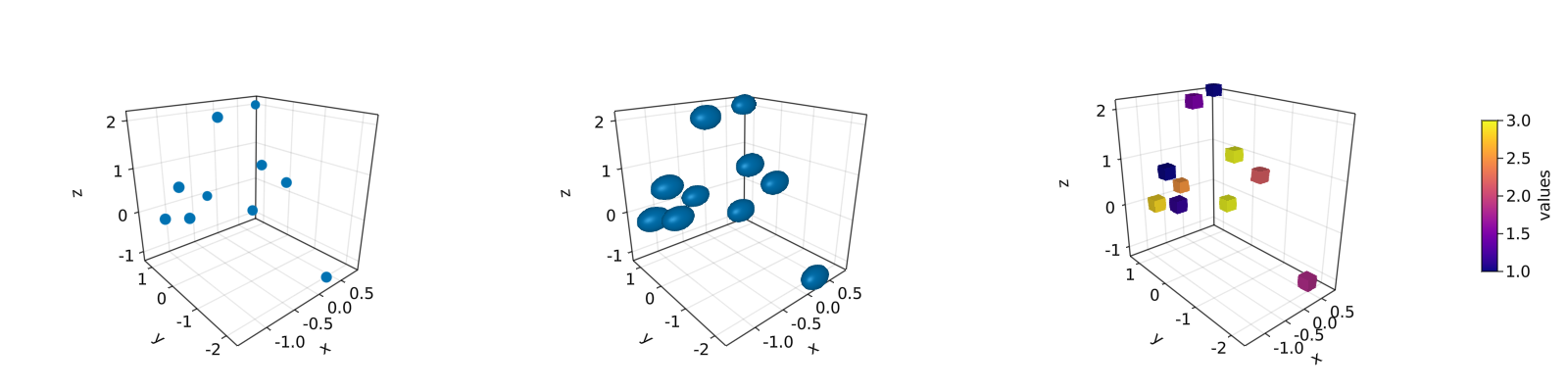
另请注意,标记可以是不同的几何实体,比如正方形或矩形。另外,也可以为标记设置 colormap。 对于上面位于中间的 3D 图,如果想得到获得完美的球体,那么只需如右侧图那样添加 aspect = :data 参数。 绘制 lines 或 scatterlines 也很简单:
function lines_in_3D()
    seed!(123)
    xyz = randn(10, 3)
    x, y, z = xyz[:, 1], xyz[:, 2], xyz[:, 3]
    fig = Figure(resolution=(1600, 400))
    ax1 = Axis3(fig[1, 1]; aspect=(1, 1, 1), perspectiveness=0.5)
    ax2 = Axis3(fig[1, 2]; aspect=(1, 1, 1), perspectiveness=0.5)
    ax3 = Axis3(fig[1, 3]; aspect=:data, perspectiveness=0.5)
    lines!(ax1, x, y, z; color=1:size(xyz)[2], linewidth=3)
    scatterlines!(ax2, x, y, z; markersize=50)
    hm = meshscatter!(ax3, x, y, z; markersize=0.2, color=1:size(xyz)[2])
    lines!(ax3, x, y, z; color=1:size(xyz)[2])
    Colorbar(fig[2, 1], hm; label="values", height=15, vertical=false,
        flipaxis=false, ticksize=15, tickalign=1, width=Relative(3.55 / 4))
    fig
end
lines_in_3D()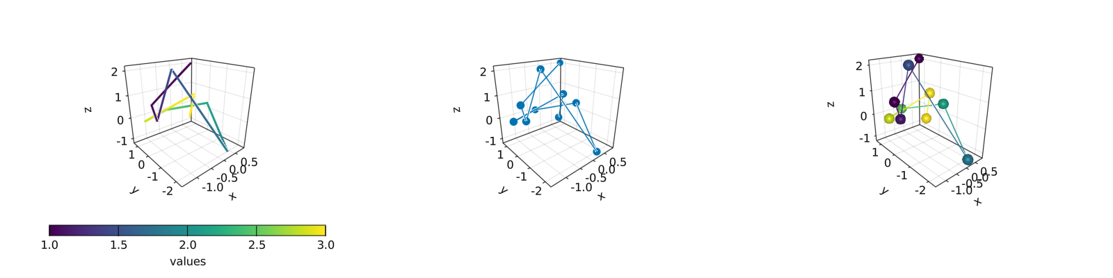
在 3D 图中绘制 surface, wireframe 和 contour 是一项容易的工作。
surface,wireframe,contour,contourf 和 contour3d
将使用如下的 peaks 函数展示这些例子:
function peaks(; n=49)
    x = LinRange(-3, 3, n)
    y = LinRange(-3, 3, n)
    a = 3 * (1 .- x') .^ 2 .* exp.(-(x' .^ 2) .- (y .+ 1) .^ 2)
    b = 10 * (x' / 5 .- x' .^ 3 .- y .^ 5) .* exp.(-x' .^ 2 .- y .^ 2)
    c = 1 / 3 * exp.(-(x' .+ 1) .^ 2 .- y .^ 2)
    return (x, y, a .- b .- c)
end
不同绘图函数的输出如下:
function plot_peaks_function()
    x, y, z = peaks()
    x2, y2, z2 = peaks(; n=15)
    fig = Figure(resolution=(1600, 400), fontsize=26)
    axs = [Axis3(fig[1, i]; aspect=(1, 1, 1)) for i = 1:3]
    hm = surface!(axs[1], x, y, z)
    wireframe!(axs[2], x2, y2, z2)
    contour3d!(axs[3], x, y, z; levels=20)
    Colorbar(fig[1, 4], hm, height=Relative(0.5))
    fig
end
plot_peaks_function()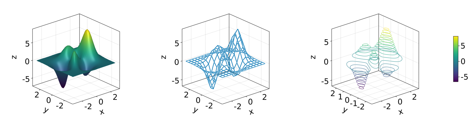
但是也可以使用 heatmap(x, y, z),contour(x, y, z) 或 contourf(x, y, z) 绘图:
function heatmap_contour_and_contourf()
    x, y, z = peaks()
    fig = Figure(resolution=(1600, 400), fontsize=26)
    axs = [Axis(fig[1, i]; aspect=DataAspect()) for i = 1:3]
    hm = heatmap!(axs[1], x, y, z)
    contour!(axs[2], x, y, z; levels=20)
    contourf!(axs[3], x, y, z)
    Colorbar(fig[1, 4], hm, height=Relative(0.5))
    fig
end
heatmap_contour_and_contourf()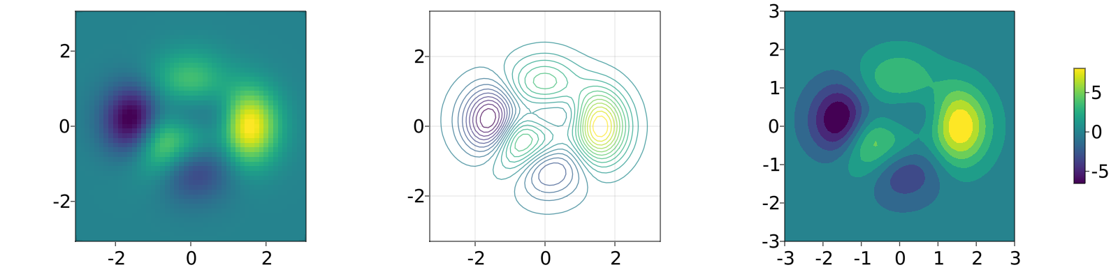
另外,只要将Axis 更改为 Axis3,这些图就会自动位于 x-y 平面:
function heatmap_contour_and_contourf_in_a_3d_plane()
    x, y, z = peaks()
    fig = Figure(resolution=(1600, 400), fontsize=26)
    axs = [Axis3(fig[1, i]) for i = 1:3]
    hm = heatmap!(axs[1], x, y, z)
    contour!(axs[2], x, y, z; levels=20)
    contourf!(axs[3], x, y, z)
    Colorbar(fig[1, 4], hm, height=Relative(0.5))
    fig
end
heatmap_contour_and_contourf_in_a_3d_plane()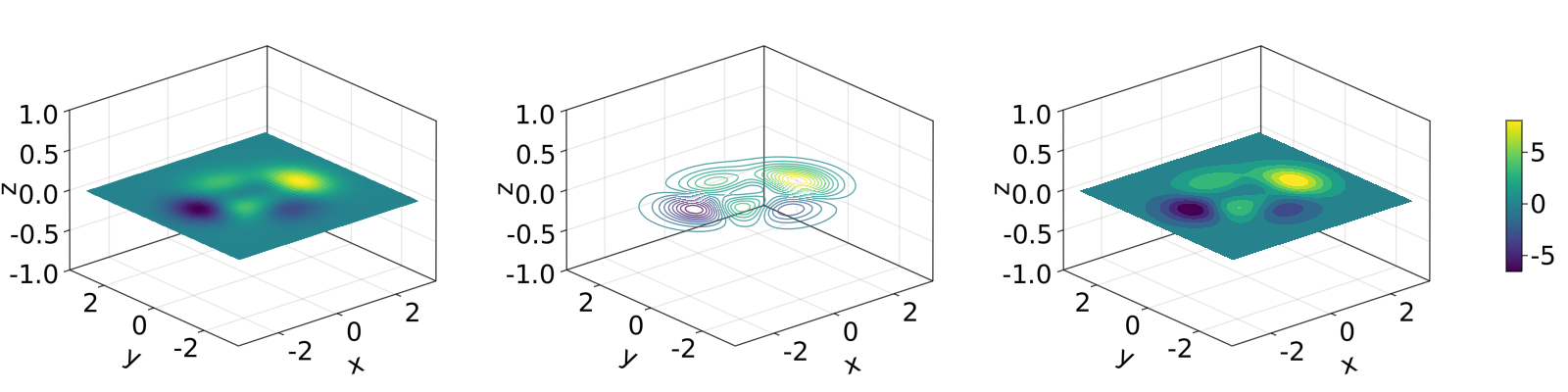
将这些绘图函数混合在一起也是非常简单的,如下所示:
using TestImages
function mixing_surface_contour3d_contour_and_contourf()
    img = testimage("coffee.png")
    x, y, z = peaks()
    cmap = :Spectral_11
    fig = Figure(resolution=(1200, 800), fontsize=26)
    ax1 = Axis3(fig[1, 1]; aspect=(1, 1, 1), elevation=pi / 6, xzpanelcolor=(:black, 0.75),
        perspectiveness=0.5, yzpanelcolor=:black, zgridcolor=:grey70,
        ygridcolor=:grey70, xgridcolor=:grey70)
    ax2 = Axis3(fig[1, 3]; aspect=(1, 1, 1), elevation=pi / 6, perspectiveness=0.5)
    hm = surface!(ax1, x, y, z; colormap=(cmap, 0.95), shading=true)
    contour3d!(ax1, x, y, z .+ 0.02; colormap=cmap, levels=20, linewidth=2)
    xmin, ymin, zmin = minimum(ax1.finallimits[])
    xmax, ymax, zmax = maximum(ax1.finallimits[])
    contour!(ax1, x, y, z; colormap=cmap, levels=20, transformation=(:xy, zmax))
    contourf!(ax1, x, y, z; colormap=cmap, transformation=(:xy, zmin))
    Colorbar(fig[1, 2], hm, width=15, ticksize=15, tickalign=1, height=Relative(0.35))
    # transformations into planes
    heatmap!(ax2, x, y, z; colormap=:viridis, transformation=(:yz, 3.5))
    contourf!(ax2, x, y, z; colormap=:CMRmap, transformation=(:xy, -3.5))
    contourf!(ax2, x, y, z; colormap=:bone_1, transformation=(:xz, 3.5))
    image!(ax2, -3 .. 3, -3 .. 2, rotr90(img); transformation=(:xy, 3.8))
    xlims!(ax2, -3.8, 3.8)
    ylims!(ax2, -3.8, 3.8)
    zlims!(ax2, -3.8, 3.8)
    fig
end
mixing_surface_contour3d_contour_and_contourf()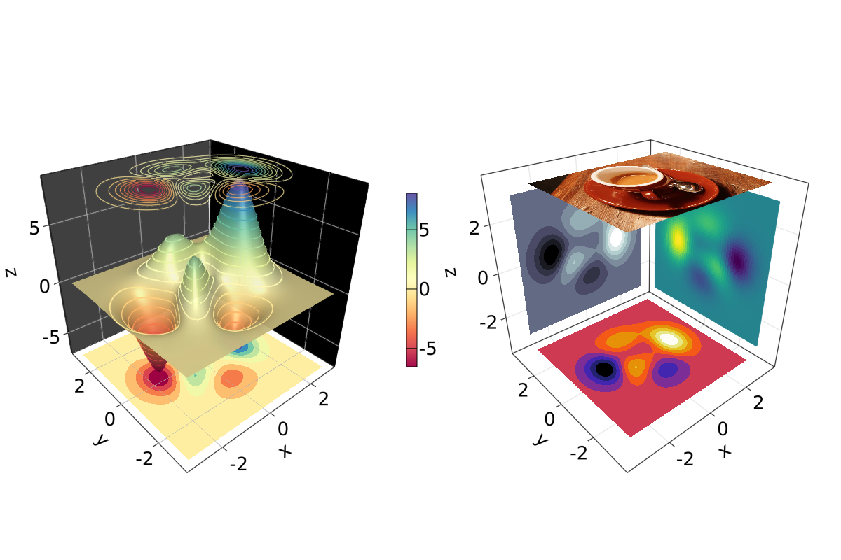
还不错,对吧?从这里也可以看出,任何的 heatmap, contour,contourf 和 image 都可以绘制在任何平面上。
arrows 和 streamplot
当想要知道给定变量的方向时,arrows 和 streamplot 会变得非常有用。 参见如下的示例
using LinearAlgebra
function arrows_and_streamplot_in_3d()
    ps = [Point3f(x, y, z) for x = -3:1:3 for y = -3:1:3 for z = -3:1:3]
    ns = map(p -> 0.1 * rand() * Vec3f(p[2], p[3], p[1]), ps)
    lengths = norm.(ns)
    flowField(x, y, z) = Point(-y + x * (-1 + x^2 + y^2)^2, x + y * (-1 + x^2 + y^2)^2,
        z + x * (y - z^2))
    fig = Figure(resolution=(1200, 800), fontsize=26)
    axs = [Axis3(fig[1, i]; aspect=(1, 1, 1), perspectiveness=0.5) for i = 1:2]
    arrows!(axs[1], ps, ns, color=lengths, arrowsize=Vec3f0(0.2, 0.2, 0.3),
        linewidth=0.1)
    streamplot!(axs[2], flowField, -4 .. 4, -4 .. 4, -4 .. 4, colormap=:plasma,
        gridsize=(7, 7), arrow_size=0.25, linewidth=1)
    fig
end
arrows_and_streamplot_in_3d()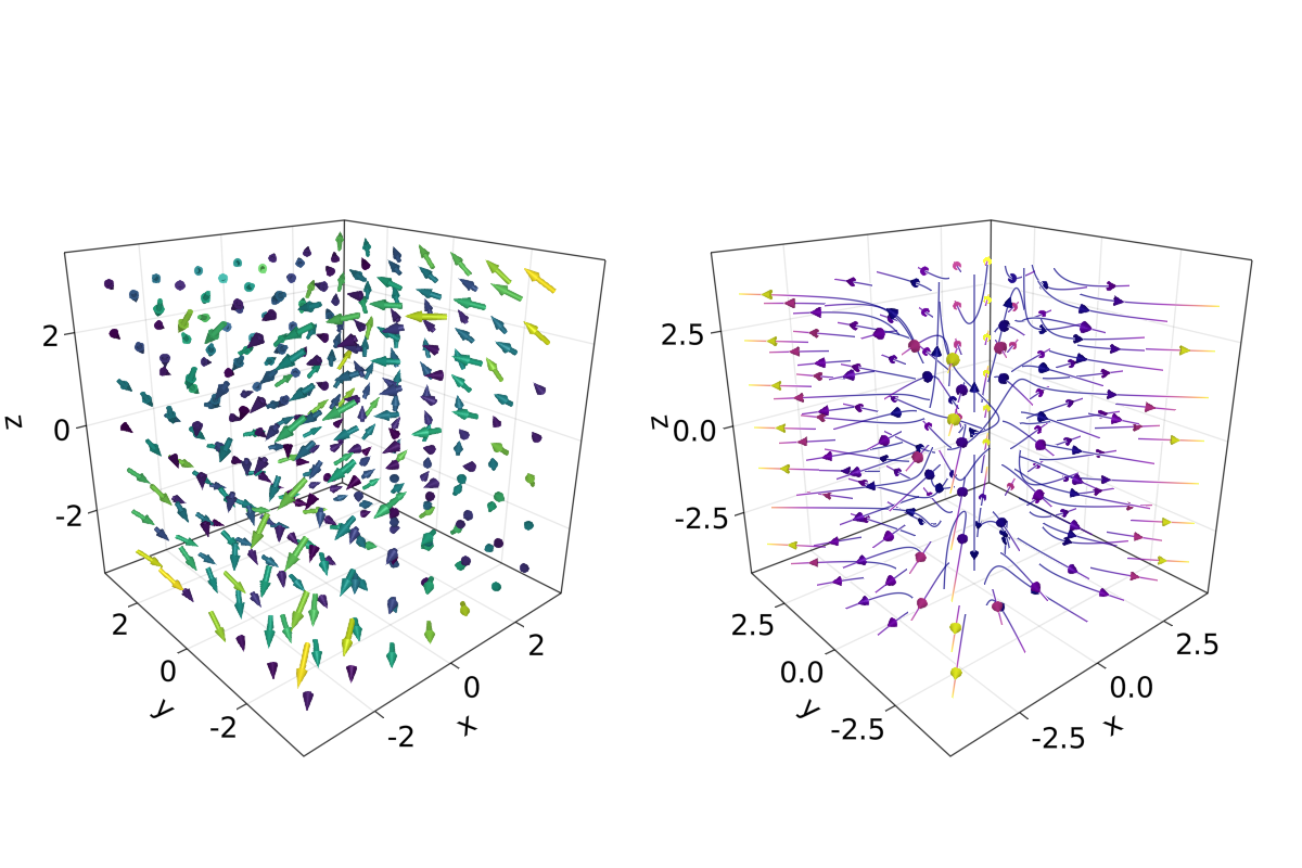
另外一些有趣的例子是 mesh(obj),volume(x, y, z, vals) 和 contour(x, y, z, vals)。
mesh 和 volume
绘制网格在想要画出几何实体时很有用,例如 Sphere 或矩形这样的几何实体,即 FRect3D。 另一种在 3D 空间中可视化的方法是调用 volume 和 contour 函数,它们通过实现 光线追踪 来模拟各种光学效果。 例子如下:
using GeometryBasics
function mesh_volume_contour()
    # mesh objects
    rectMesh = FRect3D(Vec3f(-0.5), Vec3f(1))
    recmesh = GeometryBasics.mesh(rectMesh)
    sphere = Sphere(Point3f(0), 1)
    # https://juliageometry.github.io/GeometryBasics.jl/stable/primitives/
    spheremesh = GeometryBasics.mesh(Tesselation(sphere, 64))
    # uses 64 for tesselation, a smoother sphere
    colors = [rand() for v in recmesh.position]
    # cloud points for volume
    x = y = z = 1:10
    vals = randn(10, 10, 10)
    fig = Figure(resolution=(1600, 400))
    axs = [Axis3(fig[1, i]; aspect=(1, 1, 1), perspectiveness=0.5) for i = 1:3]
    mesh!(axs[1], recmesh; color=colors, colormap=:rainbow, shading=false)
    mesh!(axs[1], spheremesh; color=(:white, 0.25), transparency=true)
    volume!(axs[2], x, y, z, vals; colormap=Reverse(:plasma))
    contour!(axs[3], x, y, z, vals; colormap=Reverse(:plasma))
    fig
end
mesh_volume_contour()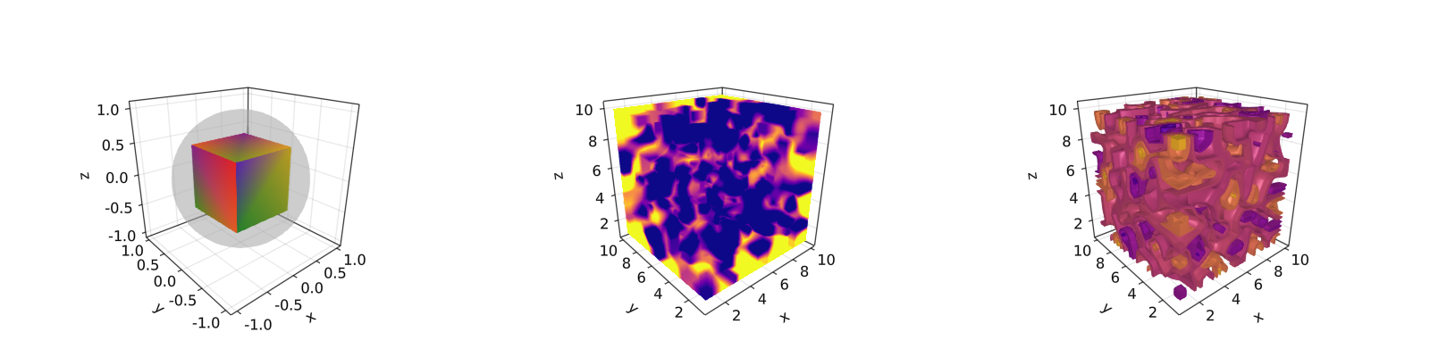
注意到透明球和立方体绘制在同一个坐标系中。 截至目前,我们已经包含了 3D 绘图的大多数用例。 另一个例子是 ?linesegments。
参考之前的例子,可以使用球体和矩形平面创建一些自定义图:
using GeometryBasics, Colors首先为球体定义一个矩形网格,而且给每个球定义不同的颜色。 另外,可以将球体和平面混合在一张图里。下面的代码定义了所有必要的数据。
seed!(123)
spheresGrid = [Point3f(i,j,k) for i in 1:2:10 for j in 1:2:10 for k in 1:2:10]
colorSphere = [RGBA(i * 0.1, j * 0.1, k * 0.1, 0.75) for i in 1:2:10 for j in 1:2:10 for k in 1:2:10]
spheresPlane = [Point3f(i,j,k) for i in 1:2.5:20 for j in 1:2.5:10 for k in 1:2.5:4]
cmap = get(colorschemes[:plasma], LinRange(0, 1, 50))
colorsPlane = cmap[rand(1:50,50)]
rectMesh = FRect3D(Vec3f(-1, -1, 2.1), Vec3f(22, 11, 0.5))
recmesh = GeometryBasics.mesh(rectMesh)
colors = [RGBA(rand(4)...) for v in recmesh.position]
然后可使用如下方式简单地绘图:
function grid_spheres_and_rectangle_as_plate()
    fig = with_theme(theme_dark()) do
        fig = Figure(resolution=(1200, 800))
        ax1 = Axis3(fig[1, 1]; aspect=:data, perspectiveness=0.5, azimuth=0.72)
        ax2 = Axis3(fig[1, 2]; aspect=:data, perspectiveness=0.5)
        meshscatter!(ax1, spheresGrid; color = colorSphere, markersize = 1,
            shading=false)
        meshscatter!(ax2, spheresPlane; color=colorsPlane, markersize = 0.75,
            lightposition=Vec3f(10, 5, 2), ambient=Vec3f(0.95, 0.95, 0.95),
            backlight=1.0f0)
        mesh!(recmesh; color=colors, colormap=:rainbow, shading=false)
        limits!(ax1, 0, 10, 0, 10, 0, 10)
        fig
    end
    fig
end
grid_spheres_and_rectangle_as_plate()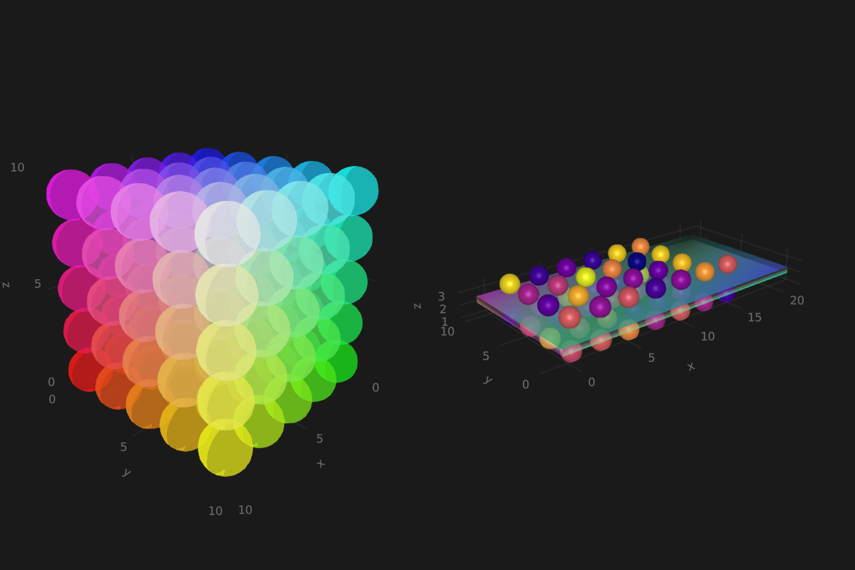
注意,右侧图中的矩形平面是半透明的,这是因为颜色函数 RGBA() 中定义了 alpha 参数。 矩形函数是通用的,因此很容易用来实现 3D 方块,而它又能用于绘制 3D 直方图。 参见如下的例子,我们将再次使用 peaks 函数并增加一些定义:
x, y, z = peaks(; n=15)
δx = (x[2] - x[1]) / 2
δy = (y[2] - y[1]) / 2
cbarPal = :Spectral_11
ztmp = (z .- minimum(z)) ./ (maximum(z .- minimum(z)))
cmap = get(colorschemes[cbarPal], ztmp)
cmap2 = reshape(cmap, size(z))
ztmp2 = abs.(z) ./ maximum(abs.(z)) .+ 0.15
其中方块的尺寸由 $\delta x, \delta y$ 指定。 cmap2 用于指定每个方块的颜色而 ztmp2 用于指定每个方块的透明度。如下图所示。
function histogram_or_bars_in_3d()
    fig = Figure(resolution=(1200, 800), fontsize=26)
    ax1 = Axis3(fig[1, 1]; aspect=(1, 1, 1), elevation=π/6,
        perspectiveness=0.5)
    ax2 = Axis3(fig[1, 2]; aspect=(1, 1, 1), perspectiveness=0.5)
    rectMesh = FRect3D(Vec3f0(-0.5, -0.5, 0), Vec3f0(1, 1, 1))
    meshscatter!(ax1, x, y, 0*z, marker = rectMesh, color = z[:],
        markersize = Vec3f.(2δx, 2δy, z[:]), colormap = :Spectral_11,
        shading=false)
    limits!(ax1, -3.5, 3.5, -3.5, 3.5, -7.45, 7.45)
    meshscatter!(ax2, x, y, 0*z, marker = rectMesh, color = z[:],
        markersize = Vec3f.(2δx, 2δy, z[:]), colormap = (:Spectral_11, 0.25),
        shading=false, transparency=true)
    for (idx, i) in enumerate(x), (idy, j) in enumerate(y)
        rectMesh = FRect3D(Vec3f(i - δx, j - δy, 0), Vec3f(2δx, 2δy, z[idx, idy]))
        recmesh = GeometryBasics.mesh(rectMesh)
        lines!(ax2, recmesh; color=(cmap2[idx, idy], ztmp2[idx, idy]))
    end
    fig
end
histogram_or_bars_in_3d()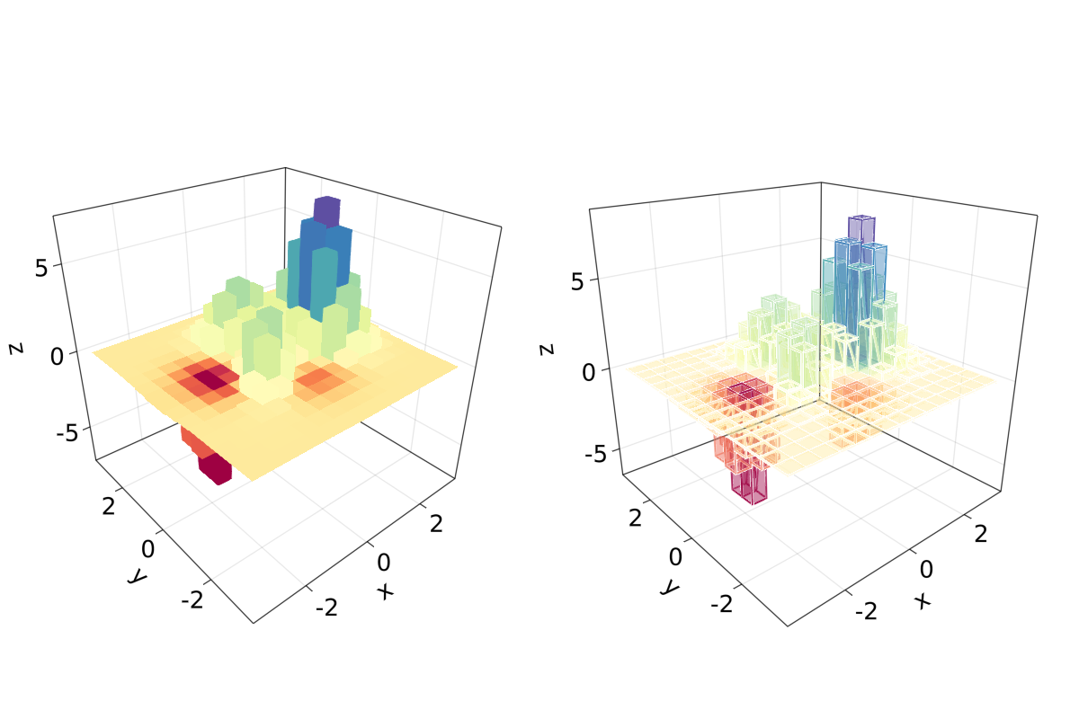
应注意到,也可以在 mesh 对象上调用 lines 或 wireframe。
填充的线和带
在最终的例子中, 我们将展示如何使用 band和一些 linesegments 填充 3D 图中的曲线:
function filled_line_and_linesegments_in_3D()
    xs = LinRange(-3, 3, 10)
    lower = [Point3f(i, -i, 0) for i in LinRange(0, 3, 100)]
    upper = [Point3f(i, -i, sin(i) * exp(-(i + i))) for i in range(0, 3, length=100)]
    fig = Figure(resolution=(1200, 800))
    axs = [Axis3(fig[1, i]; elevation=pi/6, perspectiveness=0.5) for i = 1:2]
    band!(axs[1], lower, upper, color=repeat(norm.(upper), outer=2), colormap=:CMRmap)
    lines!(axs[1], upper, color=:black)
    linesegments!(axs[2], cos.(xs), xs, sin.(xs), linewidth=5, color=1:length(xs))
    fig
end
filled_line_and_linesegments_in_3D()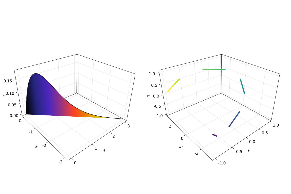
最后,我们的 3D 绘图之旅到此结束。 你可以将我们这里展示的一切结合起来,去创造令人惊叹的 3D 图!
- 1https://cn.julialang.org/JuliaDataScience/DataVisualizationMakie